Tuesday, 10 January 2012

Logo

I decided to change my logo, so I went though the font choices and picked a more suitable font. I like this one more because it looks more sophisticated than the others. I think this suits my target audience and my chosen genre. This is also the same font that I have chosen to use on my contents page for the title and the numbers.

After doing this I decided that it needed some colour, I experimented with layering and different colours. I decided that A pastel colour would look the best as it looks slightly more up-market and more sophisticated.


Monday, 9 January 2012

I used Indesign to design my contents page because it makes it much easier to split the page into columns. I have roughly laid out what I want The page to look like. I plan to do the same with my double page spread, this is so I have a rough idea of what I am doing before I start. I also want to make sure that all my pages look fairly similar to each other and if not I want to be able to easily change them. I have left empty text boxes so I can fill them later.

Thursday, 15 December 2011

Fonts

I have looked into fonts for the title of my magazine. I used www.fontspace.com and searched 'rock' in the search bar. I have chsoen these fonts because i think they are quite simple and will match the Front cover and the Font im using on the contents and double page spread. My favourite out of these would be the first one 'AHDN' or the last one 'Do it yourself' I like them because they are bold and very easy to read. I also think that it matches my title as it is only one word. Both of these font looks quite modern and new, however they are still simple. The first one is more informal and looks like it should appeal to a younger audience whereas the other looks like its aimed at younger adults and teenagers. I picked the other fonts to compare against each other, however I don't like them as much because i think they look too quirky and informal. 

Wednesday, 14 December 2011

Experimenting with Photographs


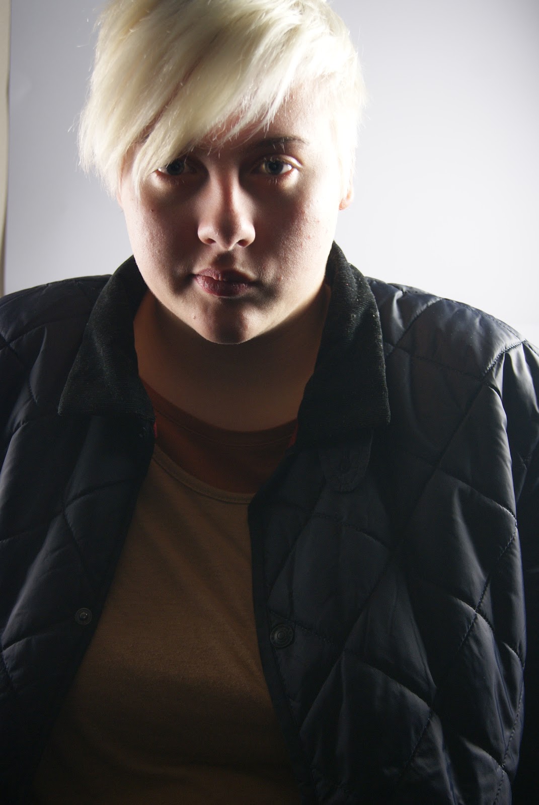
 I like this photograph a lot, However my model was holding a camera when it was taken. I want my final photograph to look similar to this however I will not have her holding anything.

 I also thought that it might be a good idea to see what it would be like with a male model, I think that the photograph turned out quite well however it looks quite intimidating and so I think I prefer a female model.


Today I Took some photographs for the front of my magazine. I experiemtned with light, angles and facial expressions. I Think that the photogrpahs look most effective when the light on one side is bright that the light on the other, This brings out all the detail on one side of the face, making it look clear and darker on the other side. I have directly approached my model in most of the photographs taken because i think its best when the model is looking straight at the reader. The direct gaze helps stimulate interaction with each individual reader, This could help  however I did take some photographs at different angles to capture different parts of the face, seeing what would look better. I also think that the photograph looks better when my model has a blank facial expression, this is because I believe it makes the magazine look more serious.


Sunday, 11 December 2011

Target Audience

 I have researched into my target Audience and what their ideal magazine would be, I have discovered that my target audience (young adults, teenagers) who are interested in more Alternative music magazine like more sophisticated magazines. My brother likes a similar genre of music to what my magazine is about. I also asked around my friends and classes how they would expect my magazine to look, most of the answer I got revealed that they thought that magazines such as these look better when they are not cluttered and they are more simple and plain. 


Friday, 9 December 2011

layout ideas

Here are some Ideas for the layout of my Magazine:
 Here is an idea of what I want my front page to look like. I think that it could look quite professional when its finished. I like that it isn't too overcrowded and cluttered. 
I really ike this design for my contents page, I think it could look really neat and sophisticated. I have chosen a Modern Font to make it look more stylish, I like it because the font is quite fresh and new but still uses older, more traditional techniques because there are serifs. I think that the layout of this page could be quite confusing so to make it clearer I will separate the text, numbers and pictures from the others slightly so you can easily see what goes where. I want the background to be white so the text and the photographs stand out.  The will be some negative space around he edge but I think that is quite useful as it brings your attention into the centre of the page. Contents will be Written in in large upper case letter across the top. This tells the reader straight away what it is, the upper case lettering means that there are no ascenders and descenders, this makes it look more formal and upper class.
I like this design for my double page spread, I think that when its finished it will look really good. I am going to use the same colour scheme throughout my magazine and will use the same fonts as what I used  on the contents page. The photograph on the left will spread across the whole left page and onto the right. I will use the same model as who i used on the front cover in this photograph. 

Tuesday, 6 December 2011

Today I Organised a date with my model for when we can experiment with taken photographs for my final magazine. I need to experiment with lighting in the studio. I will also bring in my props so I can see how it looks against the background in the studio. We thought that Tuesday was suitable as we both had available frees at the same time, so I have Corrected my Calender.