 I have looked into fonts for the title of my magazine. I used www.fontspace.com and searched 'rock' in the search bar. I have chsoen these fonts because i think they are quite simple and will match the Front cover and the Font im using on the contents and double page spread. My favourite out of these would be the first one 'AHDN' or the last one 'Do it yourself' I like them because they are bold and very easy to read. I also think that it matches my title as it is only one word. Both of these font looks quite modern and new, however they are still simple. The first one is more informal and looks like it should appeal to a younger audience whereas the other looks like its aimed at younger adults and teenagers. I picked the other fonts to compare against each other, however I don't like them as much because i think they look too quirky and informal.
 Thursday, 15 December 2011
Fonts
I have looked into fonts for the title of my magazine. I used www.fontspace.com and searched 'rock' in the search bar. I have chsoen these fonts because i think they are quite simple and will match the Front cover and the Font im using on the contents and double page spread. My favourite out of these would be the first one 'AHDN' or the last one 'Do it yourself' I like them because they are bold and very easy to read. I also think that it matches my title as it is only one word. Both of these font looks quite modern and new, however they are still simple. The first one is more informal and looks like it should appeal to a younger audience whereas the other looks like its aimed at younger adults and teenagers. I picked the other fonts to compare against each other, however I don't like them as much because i think they look too quirky and informal. Wednesday, 14 December 2011
Experimenting with Photographs


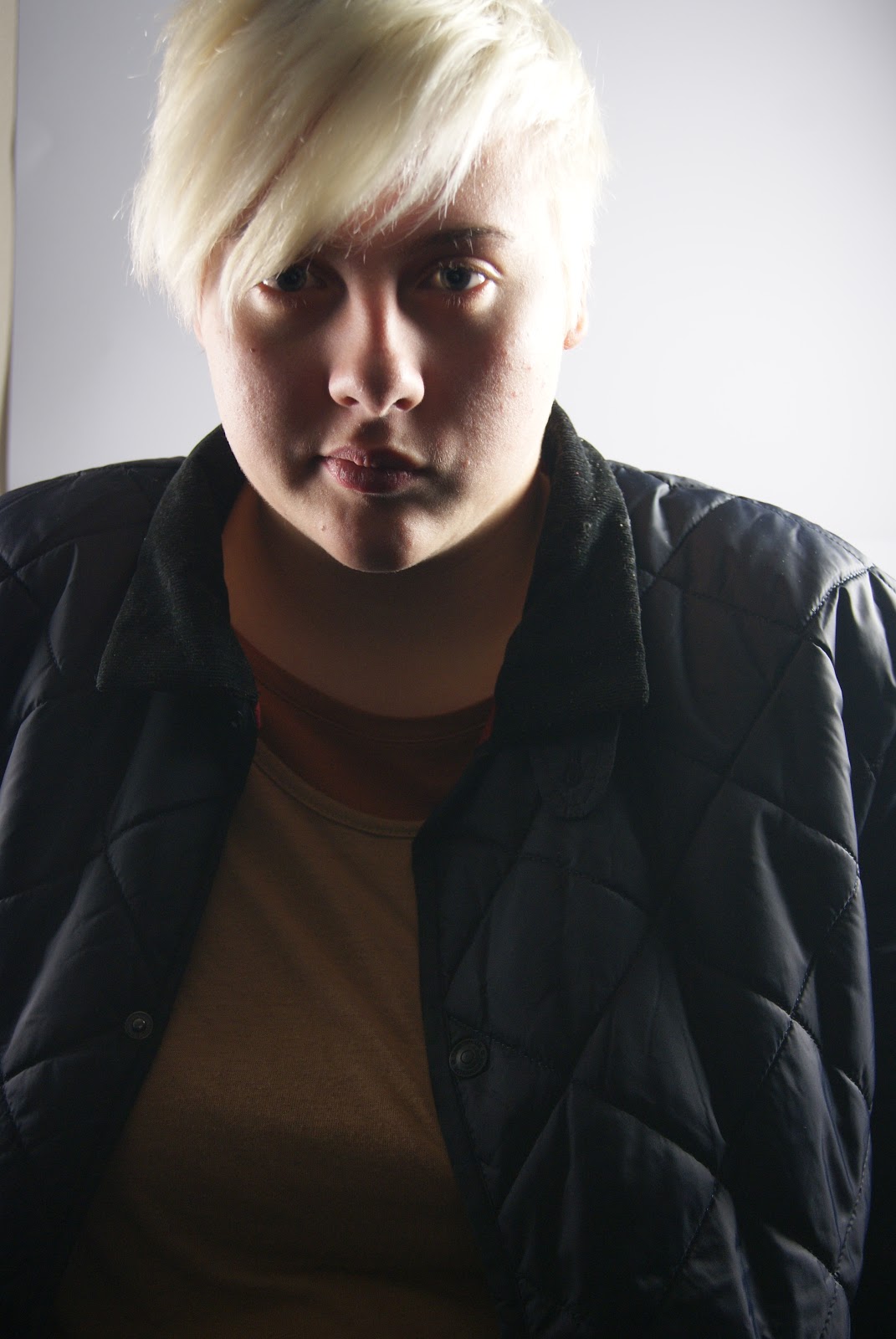
Today I Took some photographs for the front of my magazine. I experiemtned with light, angles and facial expressions. I Think that the photogrpahs look most effective when the light on one side is bright that the light on the other, This brings out all the detail on one side of the face, making it look clear and darker on the other side. I have directly approached my model in most of the photographs taken because i think its best when the model is looking straight at the reader. The direct gaze helps stimulate interaction with each individual reader, This could help however I did take some photographs at different angles to capture different parts of the face, seeing what would look better. I also think that the photograph looks better when my model has a blank facial expression, this is because I believe it makes the magazine look more serious.


Sunday, 11 December 2011
Target Audience
I have researched into my target Audience and what their ideal magazine would be, I have discovered that my target audience (young adults, teenagers) who are interested in more Alternative music magazine like more sophisticated magazines. My brother likes a similar genre of music to what my magazine is about. I also asked around my friends and classes how they would expect my magazine to look, most of the answer I got revealed that they thought that magazines such as these look better when they are not cluttered and they are more simple and plain.
Friday, 9 December 2011
layout ideas
Here are some Ideas for the layout of my Magazine:
 Here is an idea of what I want my front page to look like. I think that it could look quite professional when its finished. I like that it isn't too overcrowded and cluttered.

 Here is an idea of what I want my front page to look like. I think that it could look quite professional when its finished. I like that it isn't too overcrowded and cluttered.
I really ike this design for my contents page, I think it could look really neat and sophisticated. I have chosen a Modern Font to make it look more stylish, I like it because the font is quite fresh and new but still uses older, more traditional techniques because there are serifs. I think that the layout of this page could be quite confusing so to make it clearer I will separate the text, numbers and pictures from the others slightly so you can easily see what goes where. I want the background to be white so the text and the photographs stand out. The will be some negative space around he edge but I think that is quite useful as it brings your attention into the centre of the page. Contents will be Written in in large upper case letter across the top. This tells the reader straight away what it is, the upper case lettering means that there are no ascenders and descenders, this makes it look more formal and upper class.

I like this design for my double page spread, I think that when its finished it will look really good. I am going to use the same colour scheme throughout my magazine and will use the same fonts as what I used on the contents page. The photograph on the left will spread across the whole left page and onto the right. I will use the same model as who i used on the front cover in this photograph.
Tuesday, 6 December 2011
Today I Organised a date with my model for when we can experiment with taken photographs for my final magazine. I need to experiment with lighting in the studio. I will also bring in my props so I can see how it looks against the background in the studio. We thought that Tuesday was suitable as we both had available frees at the same time, so I have Corrected my Calender.

Props and Photographs

 I have decided that I want the front cover of my magazine to be quite plain, I think that I will just have a headshot, with plain clothing. Similar to the Photograph on the front page of the clash magazine that I researched (left. ) I'm going to use my Sony Alpha 330 Camera as the lense I have is specifically for Portraits and Close-ups.
 However, On the Double page spread I would like the picture to go across one and a half pages. I would like it to be taken outside and as the genre for my magazine is alternative music, i would like it to include a instrument, Possibly a Guitar or a ukulele.
Monday, 5 December 2011

Planning - Start of time Management.

today was my first lesson when I started planning my magazine. I thought it was senible to start with time management so I can follow when planning. I though it would be a good idea to use the Outlook Web App because it is fairly simple to use and I can printscreen it.
 I have Carefully thought about timing and what is most important. And have left some time on the last day to catch up on anything that I might have missed or not had time for.
 Friday, 2 December 2011
NME Magazine Analysis

NME is a popular magazine based on a very wide range of genres however, the genre most occurring is rock and so I have chosen this magazine to analyse.
 The font of this magazine is mainly red and black, This is so it stands out from the white background. 'Cool List 2011' suggests that this magazine is all you need, it is written in a large, upper case font so it is easy to see and clear to read. This also tells the reader what to expect inside the magazine.'Who is number one?' Makes the reader want to buy the magazine to find out who is at the top of the charts and who they should be listening to. There are images below this text of famous artists, this suggests that they are part of the cool list.
  Most of the models on the front of the cover are looking right at the reader, this would usually make the magazine look quite serious and could intimidate the reader into buying that magazine. However, the photographs of these people have been made smaller and have all been seperated from each other so there is space in between. This makes the magazine look slightly more quirky.
  The title is writen in block capitals so it is clear and easy to see, this also means that there are no ascenders and descenders so it looks more formal and up market. The font is sans serif and is quite modern. 'Next years headliners revealed' Suggest to the reader that they should stay on top of who is at the top of the charts by knowing who is headlining.
  This contents page is quite busy and cluttered, however I think it looks very effective and really modern and stylish.
 This is a sans serif font, which is quite traditional, It is in written in uppercase lettering and is black so it stands out from the white background. The upper case lettering means that there are no ascenders or descenders so it looks more formal and up-market, similar to the front cover. The lettering and the style of writing almost makes it look like it should be a newspaper, it looks formal and looks like it should appeal to an older target audience.
 This is contrasted by the images below of teens at concerts and the popular bands and artists. The images and text on this page are very close together and makes the page looks very cluttered, however they are separated by a line so it is easy to tell which images goes with what text.
This title uses the rule of three, this suggests that things are more effective in sets of three's. In this case, It makes it more effective. It is also asking questions, meaning that the reader will want to know the answer, this could persuade them to buy the magazine as they want to know which bands is headlining at the festival.
Clash Magazine Analysis

this magazine is Specifically aimed at people who are interested in Alternative rock music, I have chosen to analyse this magazine because The genre of the magazine is Similar to what I want my genre to be. This cover is very simple. The photograph of 'Jamie xx' has been used as a background and the title and captions have been printed on top, there is very few anchorage on the page which makes the page look very plain and the text is quite limited, this magazine targets ususal readers. I think this magazine is quite effective to people who know about The magazine and the Artists However it can be quite vague to people who have never heard of it before. The Banner is across the top of the page, it is written in a Sans serif font and its clear and bold.

 All the Text on this page Is in upper case, so there are no ascenders and descenders. This connotes that the magazine is serious and also makes it look more modern and sophisticated it also makes it look more neat and orderly. However, the caption is written in a Serif font, Which is more decorative. The white font colour makes it stand out against the darker background, making it look clearer.
  Jamie xx is featured on the front of this magazine, A well known artist to people who are interested in this type of music, which may attract and influence people to buy the magazine. The Image is in direct mode of address, where the person is look straight at the reader. The direct gaze helps stimulate interaction with each individual reader, this almost makes us feel like he is intimidating us into buying the magazine. The photograph is a head shot and takes up the whole page. The Artist featured on the front of the album is a well known Music Producer. The background in the photograph has been edited. The main focus of the photograph is his face as his hand, the subject looks quite stern which connotes seriousness.
 The contents page in this magazine is a double page spread, it is fairly simple and plain however it looks very professional. 'Contents' is in a large font to instantly catch the readers eye.

 The pictures on this Page are very small and simple, They feature Different artists, Fashion and art. However, none of these photographs link to what is in the contents.
 each of the headings on these two pages are written in a slightly more stylish font, However it still makes the page look neat and sophisticated. The contents are wrriten in three collumns on each page, Each of the subheadings are written in bold above the discription, This is so they are easy to read and are more noticable. All of the text is in Upper case, this is so it looks neat as there are no ascenders and desecnders. There is quite a lot of negative space on these pages, however i think that this adds to the effect, making it look quite professional.
 Here is a double page spread taken out of the magazine, most of the two pages are taken up by photographs of the artists featured on the front of the magazine. The photograph in the middle of the pages is the same as the image on the front page. The main picture itself is quite dull, It has been edited so only parts are coloured. this brings your attention to the coloured parts of the image.

I have chosen to analyse this double page spread because it is an article about the artists on the front cover. The colour scheme, font and techniques stay the same throughout the whole magazine.
 The article itself does not include that much information, it is very brief. The colour Scheme makes the page look very professional as it looks very neat.
 Sunday, 16 October 2011
Evaluation
1) In what ways does your media product use, develop or challenge forms and conventions of real media products?
I am very pleased with my magazine cover and how it turned out, There are a lot of similarities between my magazine and a professional magazine however, If I were to do this again, I would use more of what I researched into.
- I looked through student magazines to get inspiration for the captions on the cover, I discovered that Driving lessons and help with tests was most popular, so I included this on my cover, as students
- I also noticed that Professional magazines use Bold and clear fonts that contrast the background. The background of my magazine is white, and so I chose a colour for my text and title that standsout from the white.
- Similar to other magazines, the main Feature of my magazine 'The noobs guide to Google+' is bold and very large, This connotes importance and also makes it more noticable and prominant.
- Each caption is quite large and has a smaller despription underneith, this is so when people quickly look to the magazine, they see the caption first and can read the description after if it appeals to them.
2)Who would be the audience for your media product?
-The target audience for my magazine are both male and female students at college. I have focused on each as a whole rather than what specific people like, however the magazine does include articles for both male and female such as driving lessons and how to use google plus.
3) How did you attract/address your audience?
 -I have included different captions on the front for both male and female audiences, such as 'Driving lessons - Tips on how to past your test' for both male and female audiences looking for help on driving lessons.
-I have focused on I have also included others specifically for male or female students, such as cake recipes and football Focus so that the magazine is suited for both.
-I have used soft brown colours for my title and text because it is a unisex colour, it connotes sophistacation and also is easy to red against the background.
-I have included a caption 'the noobs guide to google+' this uses slang so the readers can relate to it. Google+ is used by students everyday, they would need to know everything about it to use it to its full potential. I have also included the logo on the left to the caption as it makes it more noticable for people who just scan the cover of the magazine. The word 'Google+' has been written in a clear, bold font, it is easily noticed and shows that this is the main article in this magazine.
4) What have you learnt about technologies from the process of constructing this product?
-Throughout the task I have been Blogger to keep track of my planning and to show me what I have learnt. The blog helped me to present my work neatly and clearly and also helps me see how our magazine has develpoed over time. I think blooger was easy to use because the webiste explains very well what everything is and how to use it. However, I found it difficult To post images and move them to where I wanted.
I am very pleased with my magazine cover and how it turned out, There are a lot of similarities between my magazine and a professional magazine however, If I were to do this again, I would use more of what I researched into.
- I looked through student magazines to get inspiration for the captions on the cover, I discovered that Driving lessons and help with tests was most popular, so I included this on my cover, as students
- I also noticed that Professional magazines use Bold and clear fonts that contrast the background. The background of my magazine is white, and so I chose a colour for my text and title that standsout from the white.
- Similar to other magazines, the main Feature of my magazine 'The noobs guide to Google+' is bold and very large, This connotes importance and also makes it more noticable and prominant.
- Each caption is quite large and has a smaller despription underneith, this is so when people quickly look to the magazine, they see the caption first and can read the description after if it appeals to them.
2)Who would be the audience for your media product?
-The target audience for my magazine are both male and female students at college. I have focused on each as a whole rather than what specific people like, however the magazine does include articles for both male and female such as driving lessons and how to use google plus.
3) How did you attract/address your audience?
-I have included different captions on the front for both male and female audiences, such as 'Driving lessons - Tips on how to past your test' for both male and female audiences looking for help on driving lessons.-I have focused on I have also included others specifically for male or female students, such as cake recipes and football Focus so that the magazine is suited for both.
-I have used soft brown colours for my title and text because it is a unisex colour, it connotes sophistacation and also is easy to red against the background.
-I have included a caption 'the noobs guide to google+' this uses slang so the readers can relate to it. Google+ is used by students everyday, they would need to know everything about it to use it to its full potential. I have also included the logo on the left to the caption as it makes it more noticable for people who just scan the cover of the magazine. The word 'Google+' has been written in a clear, bold font, it is easily noticed and shows that this is the main article in this magazine.
4) What have you learnt about technologies from the process of constructing this product?
-The main software I used during this task was photoshop, I learnt how
to use the magnetic lasso tool to cut out my photographs and delete the
background. From using this tool, I have learnt that the image looks a
lot better when it is feathered around the edges or the photograph looks
too sharp.
- I have also learnt how to use the layer tool to layer my images and text, This makes the magazine cover look a lot more professional as I could over-lap the text and the images.
-I used the internet during the making of my magazine cover and contents page, I used the internet mainly for research and planning, it benefitted my magazine cover a lot because i could compare it to professional magazines and see what the difference was.
 |
| Text wrap. |
 |
| Indesign Logo |
- I used Indesign to make my contents page, I used this because I could get special effects from it that I couldn't get if I was using photoshop, such as text wrap as it looks very professional and it easy to include text and images without it looking messy and cluttered.
 |
| Column options |
 |
| -Another reason why I used indesign was because I could create columns making it easy to add text, keeping it looking neat. Our contents page has Three columns, Here is an example of two. |
 |
Blogger Logo. -I used a digital SLR to take the photographs for my front cover, I learnt that its easier to have the camera on portrait mode when taking a headshot rather than auto because it easily focuss on the face and also changes the tones of the skin, making it look softer.   |
Friday, 7 October 2011
Final Front Cover & Contents page


Here is my finished Front cover and contents page. I am very pleased with how they both turned out as I think they look fairly professional. If I was to do this task again, I would make my front page look slightly more busy and also more colourful because at the moment I think it looks too plain and empty.
Subscribe to:
Comments (Atom)