Thursday, 29 September 2011
Tuesday, 27 September 2011
Monday, 26 September 2011
Experimenting with my logo
We have chosen the last logo for our final design. we experimented with shadows to make it look more professional but we decided that the logo didn't look as good with too much shadow so I changed the logo to make it look more subtle.
Friday, 23 September 2011
Planning - Fonts
1.Phoebeeee
2.Phoebeeee
2.Phoebeeee
3.Phoebeeee
4.Phoebeeee
5.Phoebeeee
6.Phoebeeeee
7.Phoebeeee
8.Phoebeeeee
9.Phoebeee
Monday, 19 September 2011
Magazine analysis
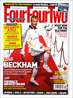
 Here is a sport magazine aimed at teenagers interested in football, featuring David Beckham, a well known footballer kicking a football on the red carpet. All of the titles are written in capitals in serif and so there are no ascenders and descenders, this makes the magazine look more bold and masculine. The image of david beckham has ben used as a background with the captions printed on top, the image is mostly in red and white whichs matches the masthead
.
The main title of the magazine is 'xbox 360'. the fact that the magazine is called xbox 360 suggests straight away that it is about xbox gaming. The image on the magazine is dark, this connotes that the game is also dark and dreary, the use of weapons suggests that possibly aimed at an older target audience. All the main text on this front cover is in white so it's easy to read against the darker background, the title itself is written in sans serif where as the caption is written in serif, the title is all in capitals and larger than all the other texts, this makes the magazine look more neat and professional as there are no ascenders of descenders. There is only one caption which identifies the main image behind it.
Here is a magazine aimed at male teenagers, Bold colours have been used such as white and black, this connotes masculinity and strentgh to attract the male audience. The word 'Free' is in written in a bold clear font and is larger than the text underneith, this means that it is easier to notice as some people might buy that magazine for the free gifts. One of the main selling points for this magazine would be The band 'Avenged Sevenfold' in the background and below is the name of the band written in bold underneith. The main colour Of the fonts are white and red, this is so it stands out from the black background. 'Kerrang' is written in black, this is so it stand out from the white banner.
The title of this magazine is 'Cozmo Girl' this suggests that the magazine is aimed at teenage girls, the image in the background supports this. The word 'girl' is written in a different font than the word 'cosmo' which is written in black. the red font stands out from the black, which puts emphisis on the word girl.
Subscribe to:
Comments (Atom)


